Sensitivity to Light

Emerging from the darkness of winter we are delighted to see the gradual, daily increase in sunlight. As architects we seem to feel its absence a bit more acutely as light is such an important element in our practice. This relationship between architecture and light is paramount in structures designed to display art. The right lighting does not just illuminate a work of art, but brings it to life, enhancing our viewing experience and appreciation.

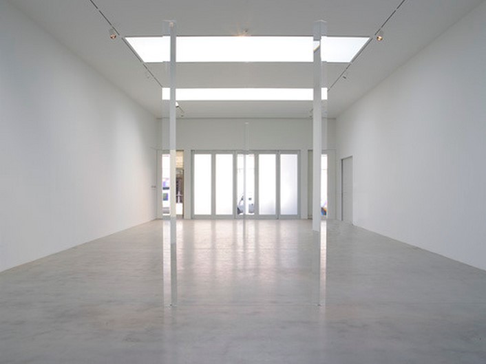
For us, Peter Zumthor’s Kunsthaus Bregenz stands as a sublime example of this harmony. Here, light is the principle design element. In the images we can see how light animates both the outer envelope and interior ceiling skylight, both constructed with the same translucent glass panels.

Peter Zumthor, Kunsthaus Bregenz (KUB), Austria, 1998.

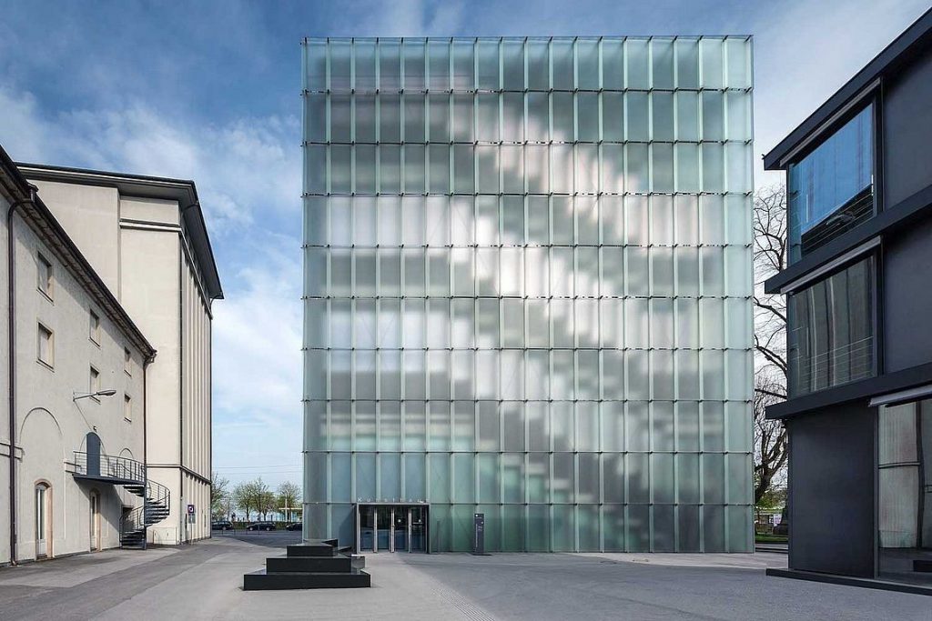
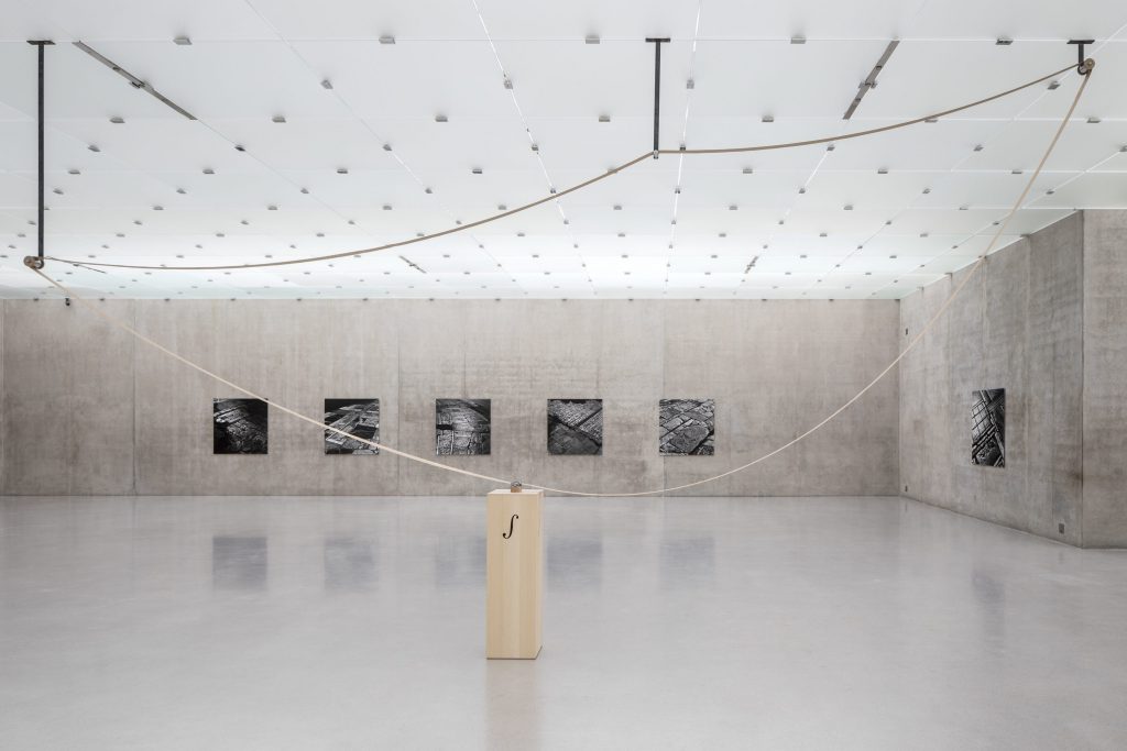
Diffuse natural lighting, activated by a light plenum, creates even illumination in each gallery. The resulting effect is a transcendent space with almost ethereal glow, ideal conditions for the appreciation of any art form.P

Peter Zumthor, Kunsthaus Bregenz (KUB), Austria, 1998.

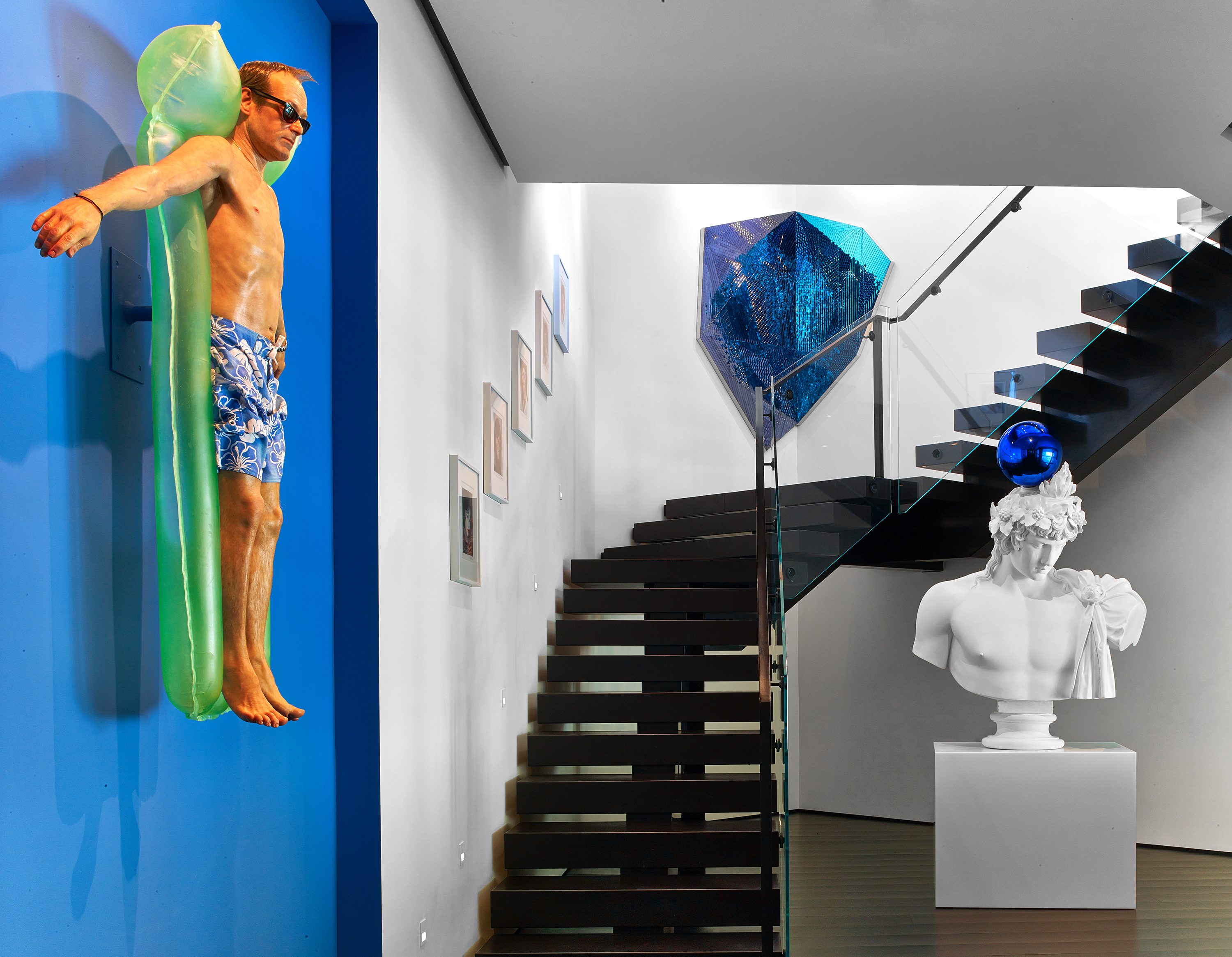
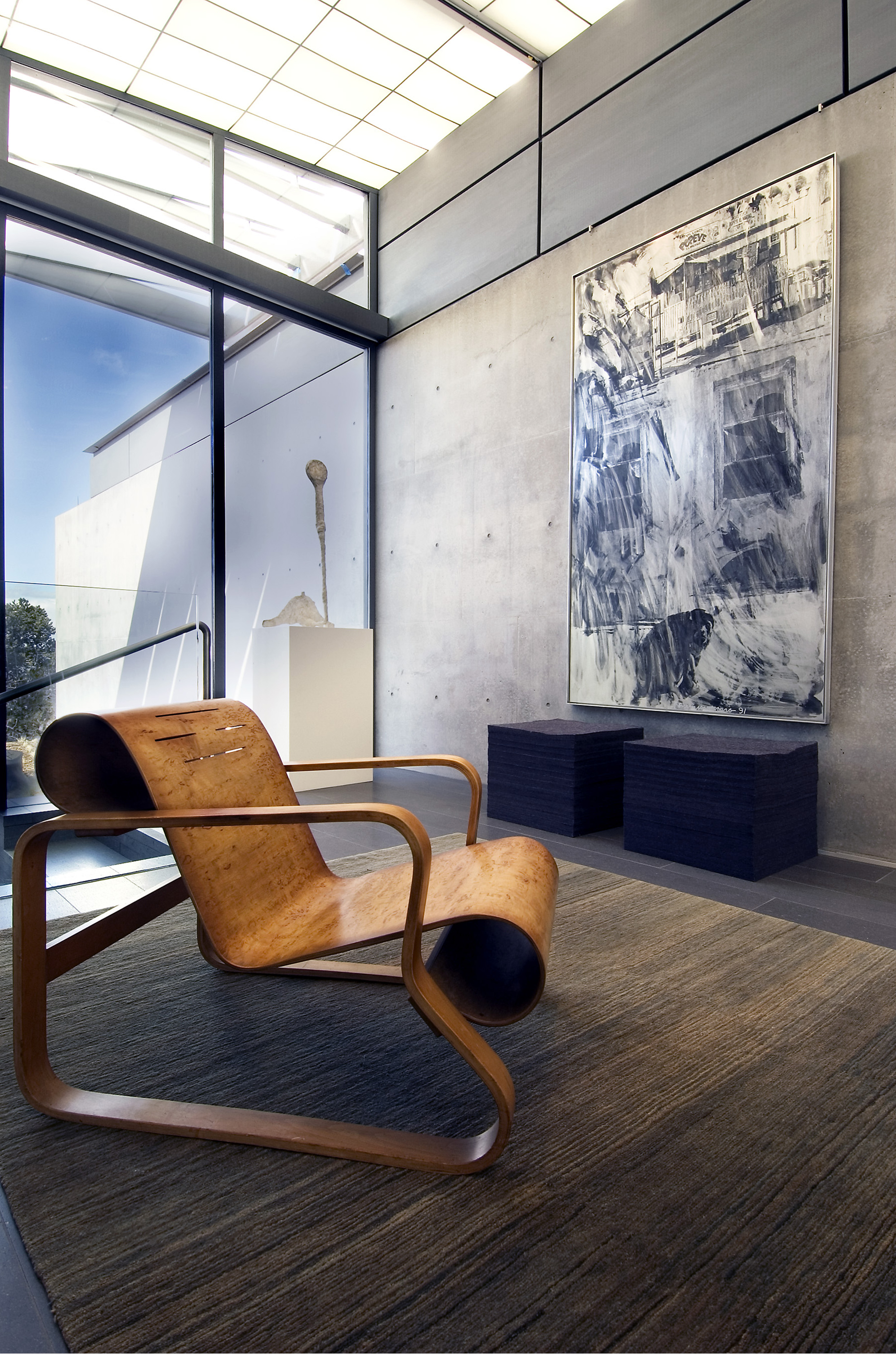
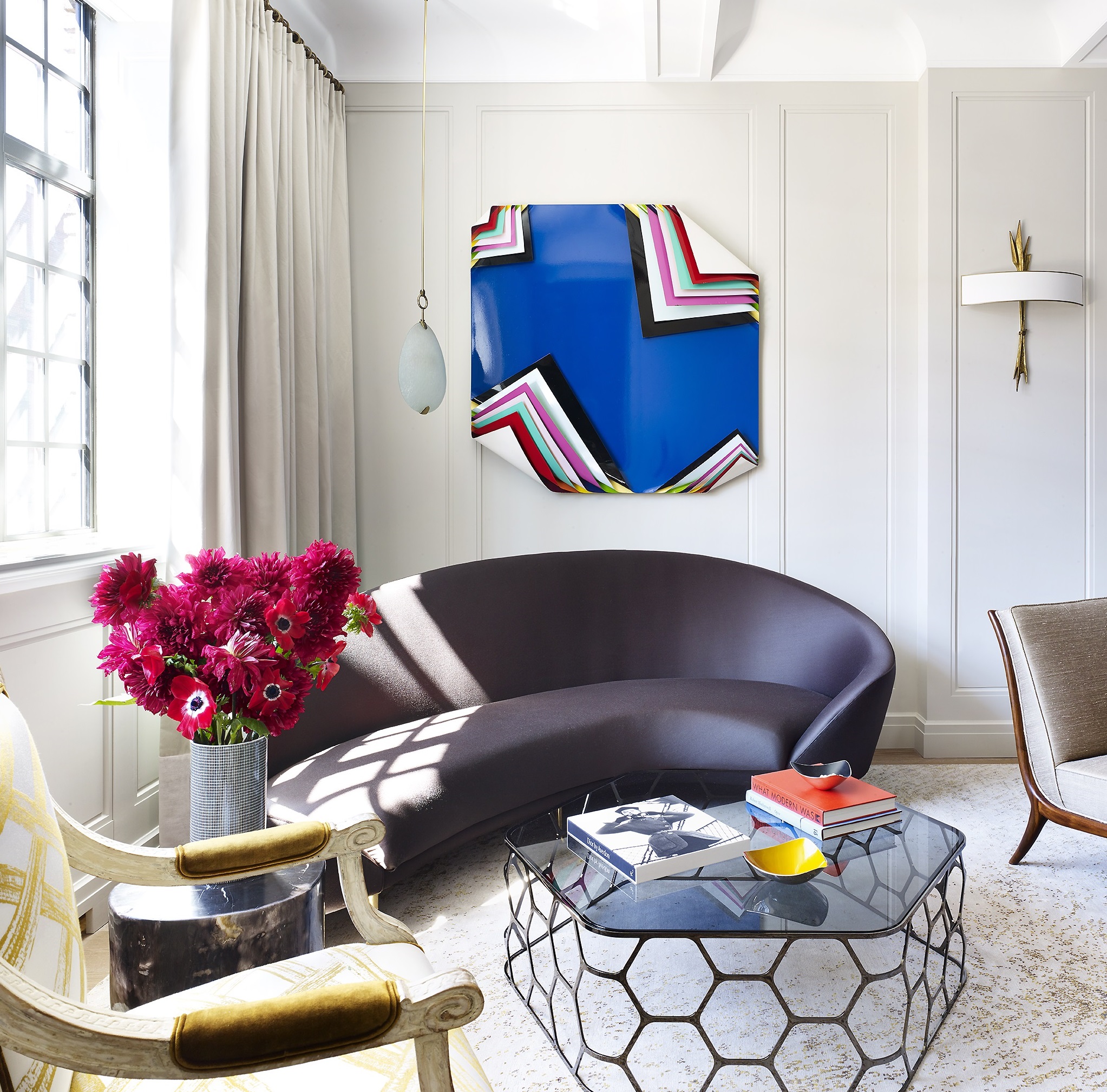
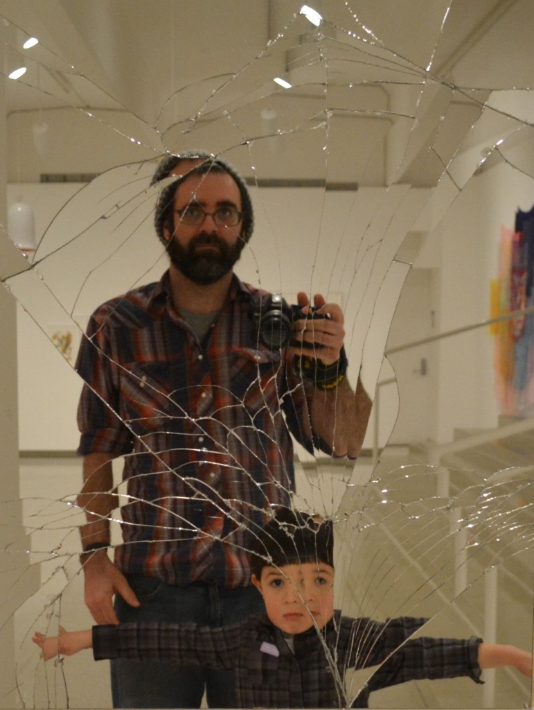
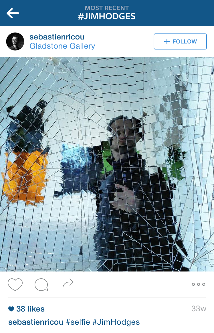
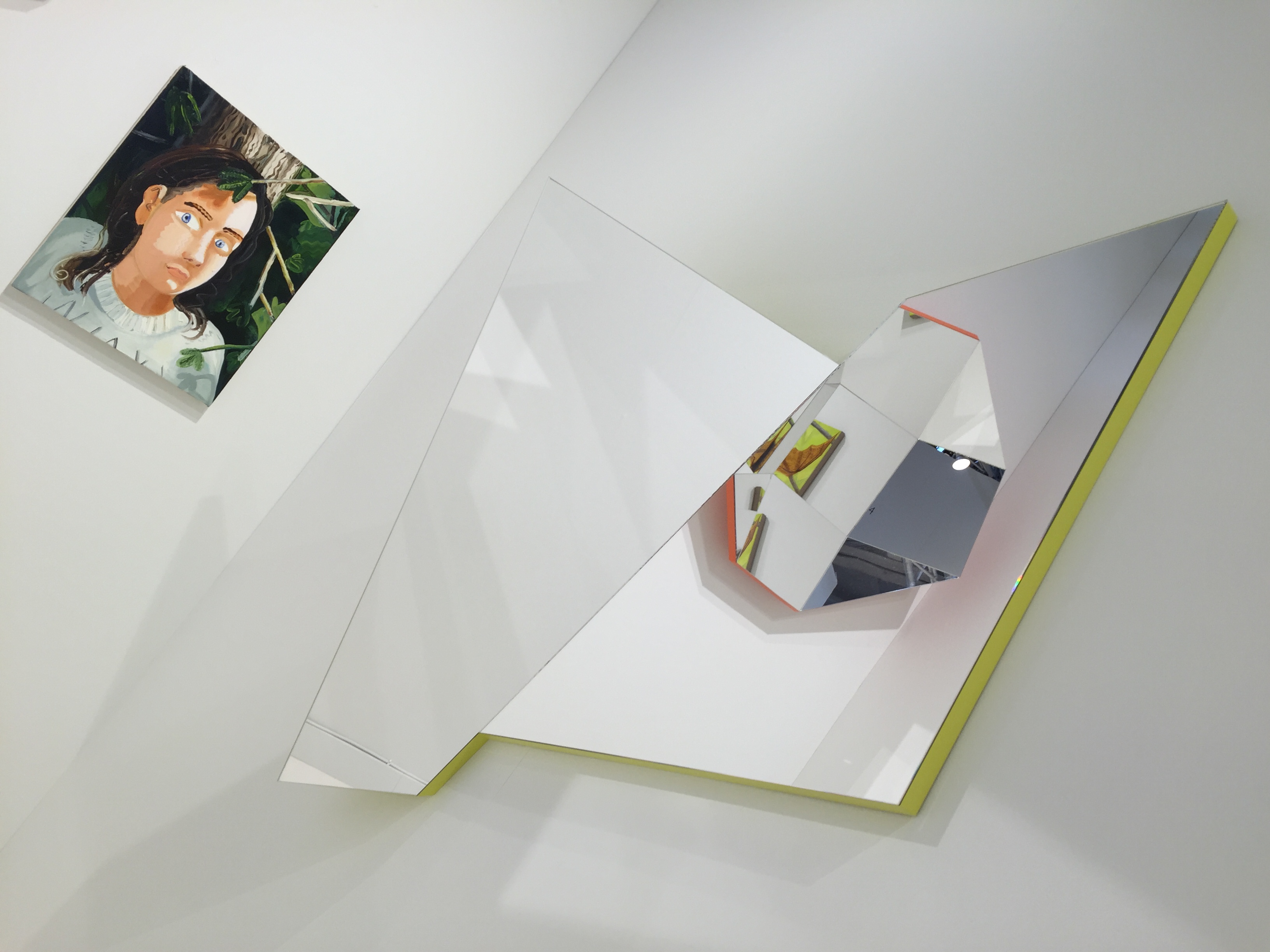
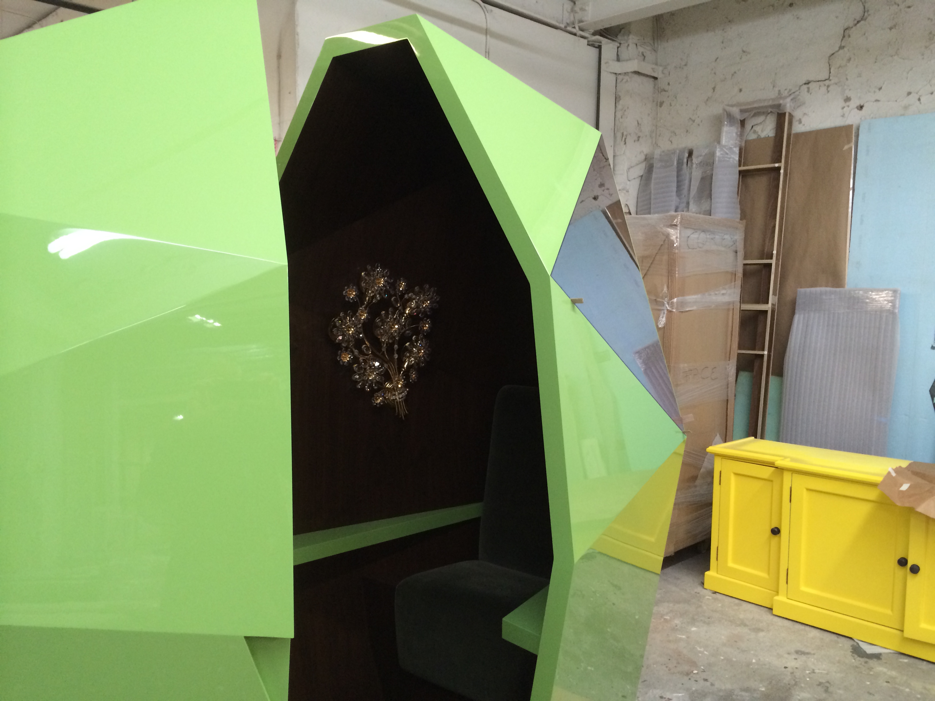
Alternatively, an ill-suited lighting strategy can render an artwork unreadable and even transform its tone or meaning, in effect killing it. Such challenges are not new; architects have been grappling with lighting strategies for galleries and collections since classical antiquity. We are conscious of the historic precedents in our practice, yet we also embrace new technologies. In our experience a successful lighting strategy is both a balance of nature and technology, yet more importantly it starts with a sensitive understanding of the art collection in question and each individual work of art within that collection.

Keeping au courant with developments in lighting technology requires quite a bit of research and expertise. 
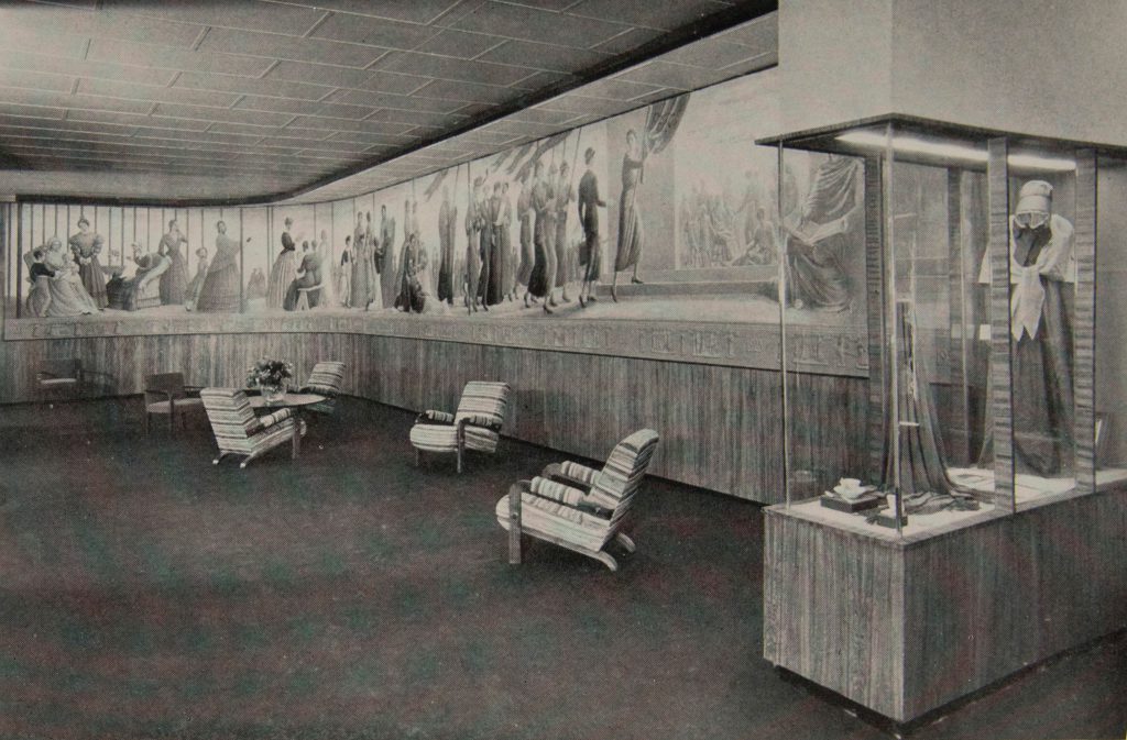
Historically innovation in lighting has been in step with the display of art from fluorescent lighting in the 1930s to prismatic film or pipe lighting systems of the 1980s.[1]

A snapshot of a historic lighting strategy for display. Chicago’s World Fair, 1933-34, Social Science Hall, National Council of Women exhibit, featuring the Progress of Women mural artist Hildreth Meière.

For lighting artwork today, we are using a powerful tool in a cutting-edge system pairing digital technology with Red, Green, Blue White (RGBW) with Light Emitting Diode (LED) lighting and packaged in a highly tunable configuration. Initially marketed as a health and wellness solution for businesses to increase productivity, we were quick to see its untapped potential in the display of art. Capable of producing millions of different hues coupled with an ability to replicate a vast range of color temperatures, high quality RGBW LED systems not only operate in unison with the day, but also can reproduce lighting conditions anywhere in the world and at any time! These systems can even replicate candlelight with no buzzing. For those of you who are not technologically savvy in this domain, this was impossible up until now. The implications of such versatile functionality in lighting are profound. Not only is the technological scope amazing but it is also easy to operate in the context of the home.

This tremendous range allows us to intelligently illuminate any collection. We can respond to each individual work of art, its production, media, surface treatment, color, etc., while respecting the collection in its entirety. Working with this powerful tool we can replicate the precise lighting conditions in which a particular work was created, and respect the original intention of the artist no matter where the work is located. This is fundamentally important in the display and appreciation of any type of art. While contemporary art might not be subject to the same lighting principles of the great master works, these new works are conceived with specific lighting conditions in mind, both natural and artificial. Contemporary artists like Olafur Eliasson, Robert Irwin, James Turrell and Ann Veronica Janssens are among the many artists who come to mind. As lighting is central to the practice of these artists, their work often requires specific lighting conditions. Irwin’s Dotting I’s and Crossing T’s, Part II was conceived in 1970 but only realized in 2012, in part, due to the specificity of lighting required to activate the work of art.[2]

Robert Irwin, Dotting I’s and Crossing T’s, Part II, 2012.

RGBW-LED systems can easily handle these challenges, with its vast capacity to differentiate the lighting (hue and temperature) of each individual bulb and fixture, etc. Now even the most eclectic collections can be illuminated in harmony.

Recently we were named the exhibition architects for the Aspen Art Museum. Not only are we thrilled at the opportunity to help shape compelling art and design programs, but we are excited to work with such a versatile and powerful lighting tool in the public display of art. Spearheading the installation of this technology is our first course of action.

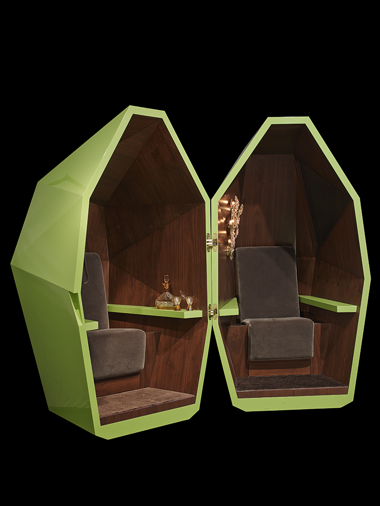
Luckily these lighting systems are not the exclusive domain of major art institutions. We are actively using RGBW-LED technology for our residences. In the home we can intelligently light private collections in accordance with the dynamics of a living space. As day passes to night, or during low-light winter days and even inclement weather, the home user can simply tune the system to the right lighting for their collection. We work closely with our clients to create the precise lighting conditions for their collections and individual works of art.

Not only is this new technology transforming the way we think about the lighting collections, but it is creating an illuminated environment which enhances our well-being and certainly our appreciation of art.


[1] Fluorescent lighting made its debut in 1939 at the World’s Fair in New York, and was featured in a backlit display of sculpture. Prismatic film, or pipe lighting systems were used typically in exhibition cases. Museums were quick to adopt new lighting technologies. The British museum was one of the first to feature electric lighting throughout and the Victoria and Albert Museum in London (then known as the South Kensington Museum) was among the first public collections to use incandesce lighting. For more information on lighting see A. Laing, Lighting (London, 1982).

[2] See the following https://www.pacegallery.com/exhibitions/11146/robert-irwin-dotting-the-i-s-crossing-the-t-s-part-ii

Art-in-Residence

According to the recently released Wealth Report “Art was the top-performing asset in Knight Frank Luxury Investment Index during 2017, rising 21 percent to overtake recent front runners wine and classic cars.”

Since classical antiquity affluent members of society have constructed grand homes around treasured art collections. Even Vitruvius, the celebrated first-century Roman author and architect, stipulated homes of prominent citizens must include a picture gallery. This relationship between art collecting and architecture emerged once again in the 15th and 16th centuries with newfound prominence. Renaissance architects built sumptuous chateaux, palazzi and stately mansions showcasing luxury collections of aristocratic patron-collectors. Today, visiting the chateaux at Fontainebleau or Versailles presents an impressive echo of the once dynamic synergy between magnificent architecture and art collections.

An American Tradition

Americans in the 19th and 20th centuries absorbed these European traditions yet formulated new relationships between art collections and architecture reflecting a pioneering spirit. These early American Medici’s notably Henry Clay Frick, Dr. Albert C. Barnes and Isabella Stewart Gardner actively built inspiring collections housed in sumptuous mansions designed with the notion of legacy and the public museum in mind.

A New Era of Collecting

Today, this fusion of stunning architecture and prized art collections is once again captivating the world’s attention. At the fore is StoneFox, a firm founded by architects Chris Stone and David Fox, authorities in the nexus between architecture, art and design. The duo met in 2001 while working on the design of a Santa Fe residence for a major collector of minimalist art. Architecture mirrored art in this minimalist home featuring blue-chip artists like Dan Flavin, Donald Judd and Agnes Martin. Since joining forces Chris and David designed, constructed and re-imagined residences for an impressive clientele of both emerging and world-renowned collectors.


A Contemporary Perspective

Given the burgeoning interest in the art market we might ask how does an emerging collector design a home centered on a non-existent collection? According to Chris and David clients are asking this question with greater frequency. This challenge was made manifest in a recent project for a Park Avenue Duplex. Hailing from a family with a long tradition of collecting antiquities and masterpieces the clients favored portrait photography yet desired to expand their collection. After closely working with the clients, testing their interests, a sophisticated museum-worthy collection of contemporary art emerged featuring artists like Lucien Smith, Walad Beshty, Jim Lambie and Jeppe Hein. With deep roots in the art world Chris and David have their fingers on the pulse of art market, and are often found at the leading art fairs, auctions and galleries around the globe. As noted in the Wealth Report impressive works of art, while not only presenting an “incredible value as an investment asset” can further increase property value.


Sensitive Conditions

Unlike most great masterpieces the display of contemporary art is at times complicated. What does a collector do with the mega-sized, monumental sculptures and paintings so common in art produced today? A collecting duo purchased a 10ft x 10ft Antony Gormley sculpture for their Old Westbury residence even though no such space to house the sculpture existed. StoneFox devised an elegant solution constructing a chaplet, a three-sided structure, with a retractable roof for easy installation. The chaplet also served as a framing device enhancing the display and appreciation of the monumental sculpture.


Starting with a database of a multi-million dollar art collection, which included among its treasures an eighteen-foot long painting by Kehinde Wiley, StoneFox designed a majestic primary residence in Palm Beach for a preeminent collecting couple, now entering in its finishing stages. Located between the ocean and the bay, an east-west orientation, the couple wanted the estate to highlight views of both bodies of water. Yet direct sunlight and art, specifically paintings and works on paper, are not a good combination. The Mark Rothko murals that once hung in Harvard’s Holyoke Center penthouse were irreparably damaged under similar circumstances. Respecting these constraints for the Palm Beach estate StoneFox drew inspiration from local vernacular architectural traditions of Palm Beach modern. Elegant screens and sweeping overhangs provide an intelligent architectural solution not only appropriate for the climate and direct sunlight, but a solution steeped in a rich architectural history. Sensitive to the complexities of caring for works of art StoneFox employed the latest technologies including an HVAC system, PVB glass, LED-RGB lighting, window treatments etc., to ensure the proper conservation of the collection, high-level environmental control as one would expect in wine and classic car collections.


Context, Place and Space

Much like our American Medici’s Isabella Stewart Gardner, Henry Clay Frick and Dr. Albert C. Barnes with their expansive collections housed in museum-residences, collectors today face similar issues of context, space and place. How easy is to merge the notion of home and gallery for expansive and expanding collections? Isabella Stewart Gardner constructed her museum with an apartment on the upper story enabling her to arrange and rearrange the collection as she saw fit. On a 1.5 acre property in Texas a collector had in mind something similar, to create a residence together with a semi-private gallery space. The resulting compound features a grand residence and adjacent three-story gallery. The sloped roof of gallery structure coupled with natural diffused northern light on the upper level creates a well-suited environment to appreciate paintings and works on paper, the lower gallery with an adjacent garden provides ample space to experience sculpture such as Jill Magid’s “Armored Station Wagon,” and finally the lower level devoid of natural light creates the perfect environment for video art. Embedded in this creative architectural envelope, a house together with the three different environments of the gallery space, is a flexibility in which the family not only can expand, but the potential pleasure of re-envisioning and rediscovery of their collection, in the same spirit of Isabella Stewart Gardner.


Contemporary Collecting and the Future

We might ask: “how much has changed since the collectors of classical antiquity and the age of the American Medici’s?” The synergy between art collecting and the sumptuous architecture housing those collections remains the same. The difference lies in the architectural solutions, the manifestation of intelligent, creative responses to domestic space making with art works in mind, so elegantly embodied in the work of StoneFox.

Florida Solar, Vote “NO!” on Amendment 1, 2016

We are working on a home in Palm Beach, Florida. It’s been an extremely interesting and complicated process. From approvals to design, there have been surprises at every turn.

solar-panels

The building will house our client’s extensive art collection and meet the demands for air quality, temperature and humidity required by public museums. The site runs from the Atlantic Ocean to the intercostal waterway-so the conditions are challenging. It is certainly not your average residential project.

Working with NY Engineers we have designed a high performance HVAC system to manage the indoor air quality, temperature, and humidity. We have also sought expert advice from glazing consultants to select the best high performance glass to make the building as energy efficient as possible. Large over hangs also shield the building during the hottest times of the day to reduce solar heat gain.

solar_array

But all of that is only part of our strategy to get the project to net zero—or in other words, to produce the same of amount of energy the house consumes. It’s a large home, with some 30,000 square feet of conditioned space. So to bring the project to zero, photovoltaics are planned to be the hero of the story.

You may have heard that it is not possible for solar to replace fossil fuels, but technology is moving us closer every day—even on such a large building. Because of the large expanse of roof area on the residence, we are able to have an array of panels substantial enough to produce roughly the same amount of energy the house consumes. It is really amazing—but there is a catch: Solar panels only make electricity when the sun is shining. The approach most home owners take to achieve Net Zero is to produce more energy than can be consumed during daylight hours. The energy leftover is transferred back to the grid for neighbors and businesses to use—ultimately reducing the amount of fossil fuel burned.

This is called net metering. The excess power is sold back to the grid and the homeowner would receive a credit. At night, when the panels are not generating power, the owners use their credits to buy power from the grid.

It’s a wonderful system—especially on hot summer days when the electrical grids are taxed the most by high consumption due to air conditioning.

The problem: just this year, the state of Florida passed a law to allow “net metering”. But nearly as soon as the law was passed, big energy companies started fighting this law and have since proposed a constitutional amendment to prevent people from net metering. This is outrageous. It discourages people from using solar and turning sunshine into clean, renewable energy.

See the link to the ballot measure: https://ballotpedia.org/Florida_Right_to_Solar_Energy_Choice_Initiative,_Amendment_1_(2016)

It is worded in a very confusing manner—intentionally, I surmise. Voting “yes” would appear to give Floridians the right to choose and operate solar panels on their homes. But in reality a “yes” vote is to eliminate net metering. Companies like Duke Power, Florida Power and Light and Koch Industries want Floridians to vote “Yes.” The reason is that a “Yes” vote ends the ability of electricity customers to feed excess solar energy onto the grids. The Big Power industry does not want individuals to make their own power as it will reduce their market share. Vote “NO” to defeat this measure and allow individuals to make solar power and share it with the grid.

Florida is one of the best states in the country for producing solar power due to the number of consistent days of sunshine. It’s also one of the most vulnerable states facing rising oceans. A vote “NO” will promote the use of solar power in Florida—a necessary move for our country.

To take action, click on this link: http://www.flsolarchoice.org/

Reflecting on Our Mirrors

Well, it’s been a year since the mirrors debuted at the Aspen Art Museum’s annual summer benefit. And it seemed time to pause and think about our experiment in creating these objects.

Since the AAM 2015 benefit, the mirrors have traveled to the Fog Fair in San Francisco with Salon 94, Hong Kong for Art Basel, and most recently London, for a photoshoot with Wallpaper Magazine.

It’s been quite a journey—for the mirrors—oh the places they’ve seen! And the faces the mirrors have peered back at!

To pull the curtain back, the idea for the project sprung out of watching our fellow humans in museums and art fairs, and also seeing Facebook and Instagram posts of museums and art fairs. A constant theme seemed to emerge: a shiny work of art is as a good as bathroom mirror. Click. Selfie made. Then post selfie and somewhere at the bottom of the post hashtag the name of the artist—to show cultural awareness. Check.

11899526_1481638978832177_1816890207_n

DSC_0807-771x1024

Facebook

Our mirrors masquerade as art, and also as mirrors—and not the best mirrors, for inevitably when you look into them, you’ll end up seeing up a nostril, are seeing the lighting in the ceiling above you. On the positive side, for those who like deals, due to the kaleidoscope effect, the viewer will sometimes see slices of your own likeness five times instead of just once! Imagine, five times the enjoyment of seeing oneself!

What is it about our society that likes to see ourselves reflected—particularly in art? Or is this really anything new at all? Ask yourself. And please, if you have the opportunity, look at our mirrors and see what you see.

image7

Suzanne

Dolly

image4

AFAM: An Unpopular Perspective

The final fate of the American Folk Art Museum (AFAM) in New York has been in the headlines again. Just last week, MoMA began demolition of the AFAM’s heralded, heavy bronze façade. Many voices, both professional and public, have decried MoMA’s decision and actions, but I for one support their move. Here’s why:

The smaller museum was already a compromised, tight space when it was entirely its own entity. It is not possible to make narrow cramped spaces work with the program of the large gallery spaces MoMA needs, unless you’re a magician.

Was the AFAM really so good that it deserved to be saved? I just don’t see the merit in saving it for its own sake.

I visited AFAM when it first opened with my mother who loves all things crafted by hand. I recall thinking the confined spaces, colors, details, lighting, and materials had little if not nothing to do with the wonderful artifacts displayed in the museum. There was a skylight that spilled light down through the center, but all in the context of some early 2000’s aesthetic, and certainly not adequately. Movement through the building was awkward, and the design did not have the delicacy of the things that were inside it. The massive facade, which I thought was sculpturally beautiful, was a contrast to the collection, but not the kind of contrast that helps one appreciate the difference between unlike things. The building didn’t reflect the spirit of American folk art in any way. I think that was unfortunate, and ultimately it’s downfall. The façade-a beautiful architectural element on it’s own (and monument to the designers) was so severe it stifled the collection.

AFAM_02

Also, the façade was an obviously expensive gesture and that, too, didn’t strike the right note with the humble nature of the treasures within. In short, it felt like a bunker or a bank, and that’s exactly the opposite experience appropriate. The end result was the museum’s purpose could not be fulfilled.

folk-art-1.jpg.662x0_q100_crop-scale

But there’s another aspect to this debacle that concerns me, and it has to do with the architects involved. Years ago, there was a panel discussion regarding what to do with the Huntington Hartford Museum on Columbus Circle, designed by Edward Durrell Stone and whether or not to landmark it with Landmarks Preservation. Billie Tsien spoke up and talked about what could be done to it in terms of additions or insertions and was very much in favor of completely altering the building—in my opinion almost as though interviewing for the position. She expressed little concern or appreciation for Stone’s design. We all saw what became of the iconic Hartford Museum, re-skinned to match its corporate neighbor, and made unrecognizable from its original design. Now I find it ironic that Ms. Tsien is one of the loudest voices when her AFAM was threatened with destruction. Todd Williams and Billie Tsien designed a Brutalist building for AFAM; it didn’t function very well, and like the Hartford Museum, it, too, became obsolete. Perhaps if the building had been truly inspired by the creativity and ingenuity of the collection within, the public would have swelled and decried its demise. Perhaps if the building were designed so that people could visit it and be inspired to craft…

Clem-2-Columbus-Circle-Edward-Durell-Stone
columbus-large

So I’m left wondering: Is the phrase “location, location, location…” always in the best interest of a small institution? The AFAM moved to be next door to MoMA hoping for visitors by adjacency. They hired a big name architect to give them a “product”. What they got was near bankruptcy, and nearly de-acquisitioning of the entire collection to the Smithsonian and no museum at all.

Palm Beach Modern

The Sun and Surf in Palm Beach.  Designed by Eugene Lawrence, it provides a striking contrast to the more traditional neighboring styles.

The Sun and Surf in Palm Beach. Designed by Eugene Lawrence, it provides a striking contrast to the more traditional neighboring styles.

We were recently commissioned to design a contemporary house in Palm Beach, a community well known for its Mediterranean style architecture – less known for its once celebrated modernist works. Although many examples were built throughout the 1950s and 1960s, including work by Edward Durrell Stone, they seldom make an appearance in books about the history of Palm Beach architecture.

Distinctive, pencil-thin columns define 400 South Ocean Boulevard, designed by Edward Durell Stone in the late 1950s.

Distinctive, pencil-thin columns define 400 South Ocean Boulevard, designed by Edward Durell Stone in the late 1950s.

Part of our process in designing a contemporary house is to research the modern tradition within the region so that our work respects its heritage while presenting a fresh iteration. In this case, we studied Palm Beach modernism.  Unfortunately, as conservative values and traditional styles took hold in the early nineteen-eighties, the value of modernism declined and the majority of these buildings were demolished.

La Ronda, an estate designed by Architect John Volk in 1969, was demolished in 2003

La Ronda, an estate designed by Architect John Volk in 1969, was demolished in 2003

During its heyday in the mid-20th century, Palm Beach modernism was a lively juxtaposition to the ubiquitous terra cotta tiled roofs and stucco walls.  Even Maurice Fatio, the Swiss born architect who became a legend for his Mediterranean Style homes, adopted a streamline sensibility to serve his client’s growing appetite for modernism.  In 1936 he produced one of the most elegant and earliest examples of Palm Beach modern design – The Reef, an 18,000 square foot beachfront estate.  Today it remains as one of the few, perhaps only, well preserved modern homes in Palm Beach.

An example of streamlined modern: The Reef by Maurice Fatio in 1936

An example of streamlined modern: The Reef by Maurice Fatio in 1936

However, the majority of modern homes have been demolished or poorly remodeled and we were left wondering how to imagine Palm Beach modern in its day.   We searched for remnants from the era. Leafing through local magazines from the 1950s and 60s, at the Society of the Four Arts Library, we discovered that Palm Beach had welcomed various waves of experimentation, imported styles, and mid-century modernism.

One Royal Palm Way Condominium, designed by Architect Howard Chilton

One Royal Palm Way Condominium, designed by Architect Howard Chilton

One image we collected catches an elegant couple emerging from a gleaming Rolls Royce.  It’s the early 1960s. They stand, impeccably dressed, against a background of steel mullions, concrete columns and flared capitols. Paper lanterns hang from an undulating roof edge and sway in the evening breeze.  The scene conveys “worldly elegance” and the ease of 1960’s modernity.  Sadly, this part of the fabled Colony Hotel was long ago demolished.

The Colony

Looking at the surviving example below – a series of sculpted sunshade screens add rhythm to the gracefully contoured building. The condominium, designed by Howard Chilton in the late 1960s, stands to this day as a mid-century gem.  Even 43 years after completion, the screens impart a lively, eye-catching quality.  Recently, the building’s owners wanted to permanently remove the screens to facilitate window replacement, but the Palm Beach Architectural Review Commission rejected the proposal siting the need to preserve the few remaining works of modern architecture.  That’s good news because it’s by looking back on historic examples like these that our future vision for a Palm Beach residence has been enlivened by its modern legacy.

Screens create character and shading for 389 South Lake Drive, designed by Howard Chilton

Screens create character and shading for 389 South Lake Drive, designed by Howard Chilton

Whisper Raum

WR_1
For Stone Fox Architects' debut blog, we explore the inspiration and genesis of Chris and David's particularly special creation… namely, the Whisper Raum. Donated to the December 2013 Winter Auction benefitting the Aspen Art Museum (AAM), Whisper Raum is a free-standing, six-foot-tall object d'art. Designed to accommodate two seated adults, the almost-emerald green, multi-angled volume is hinged along one side to permit entry and exit via a handsome, handcrafted leather strap.

Here is their discussion:

Q: What was your inspiration for Whisper Raum?

Chris: In a world where everything is being watched and monitored, how do we get away from it all, even if only for a moment? I wanted to create that space.

David: I see the Whisper Raum as a place for telling a story, perhaps a secret. It was to be a private retreat, offering a way of disconnecting from the surroundings.

Q: Where does the name for this piece come from?

David: "Raum" is the German word for space. I was in Germany for a while, attended the University of Stuttgart, and worked as an intern for HOK. I wanted our creation to have an air of curiosity, even a bit of
mystery. So Whisper Raum is a play and contrast of both familiar and unknown words.

Chris: "Whisper" seemed obvious from the start, as it's an enclosed space, one where you enter to have an offline, quiet conversation. I wanted people to think about how they might use such a place.

WR_4

Q: You mentioned a recent trip to London, specifically visiting the Sir John Soane Museum and about seeing – entirely by chance – the remarkable Cheapside Hoard. How did the museum and the jewels affect
you?

Chris: Sir John Soane wore many hats in his lifetime as an architect, designer, and art collector. The result is evident in the museum; his three town homes all combined where one can walk through a large
opening only to end up in a very small, very intimate space filled with fascinating details. I liked that sense of intrigue, delight and playfulness.


soane-6

David: On that same trip, we happened upon the Cheapside Hoard Exhibition at the Museum of London, which included a giant emerald with a carved-out space where a watch was inserted. This emerald contained the unexpected. And that's what we wanted Whisper Raum to be and do: to fascinate and to surprise. To see the Hoard, one often had to use a magnifying glass and in doing so one could witness an other-worldly detachment. All of these elements came together for the Whisper Raum.

CheapsideHoarde9cheapside-hoard
Q: Clearly, this was custom-fabrication. What went into making the Whisper Raum?

David: We turned to Aucapina Cabinets, an oldschool crafting shop in Queens run by three brothers from Ecuador, whom we've used before on very special projects. They have a 10,000 square-foot facility with a staff of 30 and do the best-quality work. It took six weeks.

39

Chris: We had to figure out how it would be built, materially. To create that contrast and surprise we spoke of earlier, we wanted the exterior to be high gloss, while the interior would be plush and seductive. The shell is made of quarter-inch MDF covered in many layers of hand-finished lacquer. You'll notice the green is deliberately just a little bit off. People question the hue, and our answer is: "it's the right color." It reminds me of what Frank Lloyd Wright said to a client about a color decision; "You'll learn to like it," [laughing].

David: The inside is clad in meticulously cut American walnut; each piece has its own unique shape. The two seats are covered in green mohair velvet. A classic 1960's Italian wall sconce and a cut crystal Czechoslovakian decanter and glass set are the only ornaments within. Finally, there is a two-way mirror, which permits a view outside but only the faintest glimpse of the interior when the sconce is on.Chris: The wall sconce is somewhat reminiscent of a brooch that a fashionable lady from the 1960s might have worn. It reminds me of the jewelry show we saw in London. The result is a subdued world, a place you can share secrets or gossip, and to feel close to another person. We love it.

52

Q: So, what is the experience?

Chris: People ask us, "What does it do?" The answer is, "Nothing." It's what you do when you're inside that defines the function of the Whisper Raum. It's like a telephone booth for a private conversation, only that the other person is there, with you.

David: In this ultra-tech era, one might expect hidden speakers inside, or a plug-in to the internet. But we didn't want that; in fact, it's just the opposite. Take a moment… retreat, relax, contemplate, but at the same time enjoy a bit of whimsy.

931336_l